This was a pitch winning branding idea. We were not asked to do a rebrand but i had some spare time and though i could do something fresh for the category.
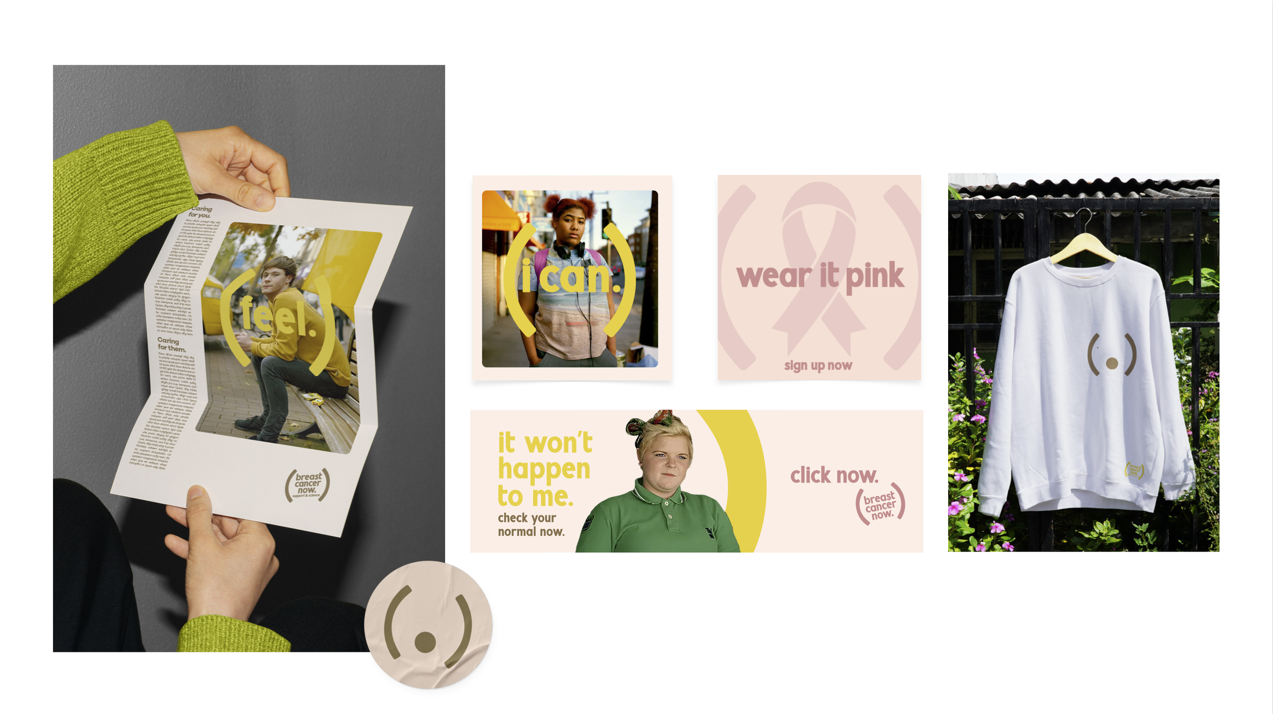
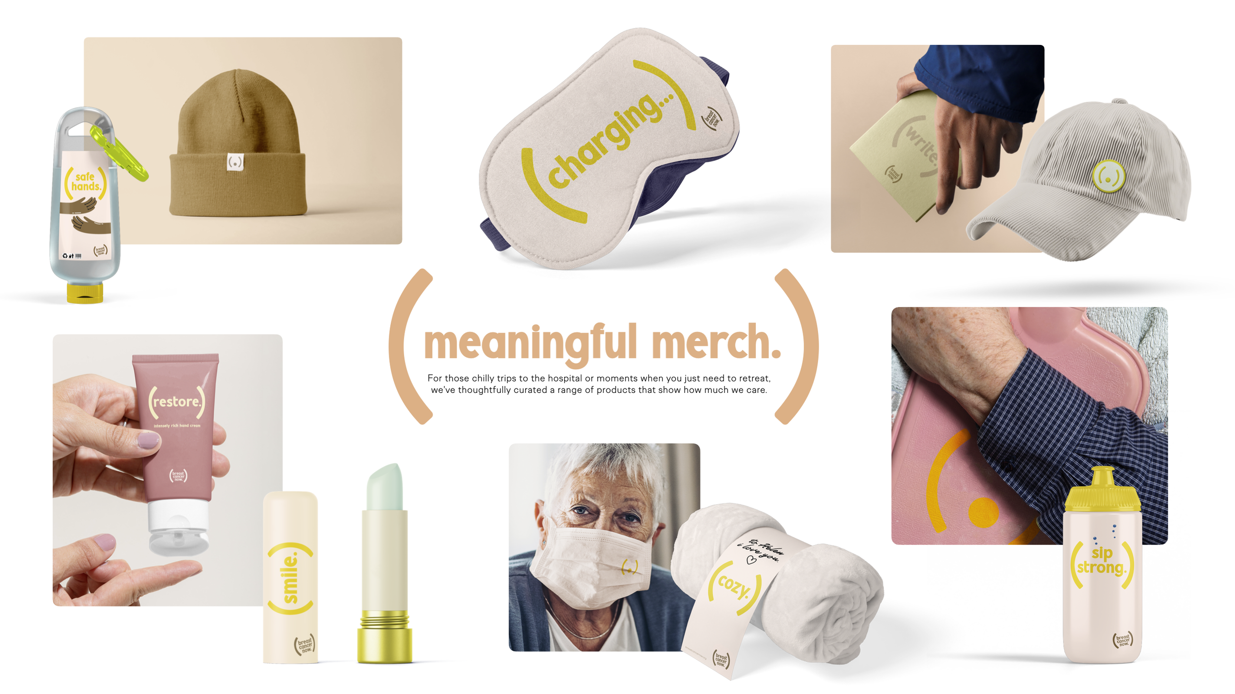
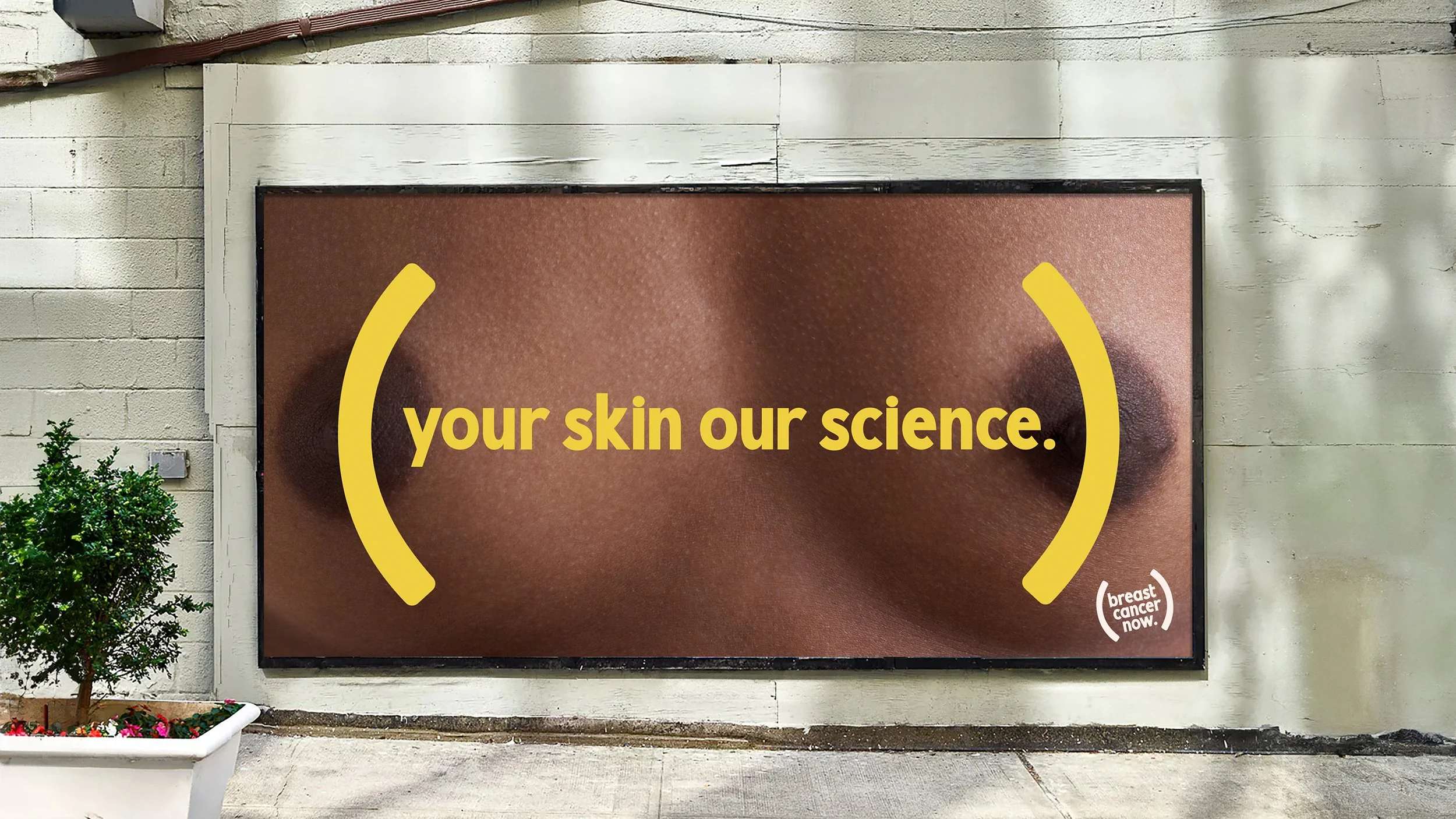
The brackets for me did a lot for the brand not only in its most simple form did it look like a symbol for a breast it worked for protection and care which is a massive part of who they are it highlights certain issues when used and also leans into the science of how they write formulas out it had lots of design thinking to its simplicity. I also worked on a arresting OOH campaign that would lead into all socials.
A brand launch idea i had was to create a logo for all skin types it would never exists in the same colour it would appear as representative as possible as that was a factor that some ethnic groups didn’t think that it could effect them.

Previous
Previous
VIASAT
Next
Next