Breast Cancer Now Logo.
The brief wasn't to rebrand the business, but I saw an opportunity to bring something fresh to the category, and the idea went on to help win the pitch.
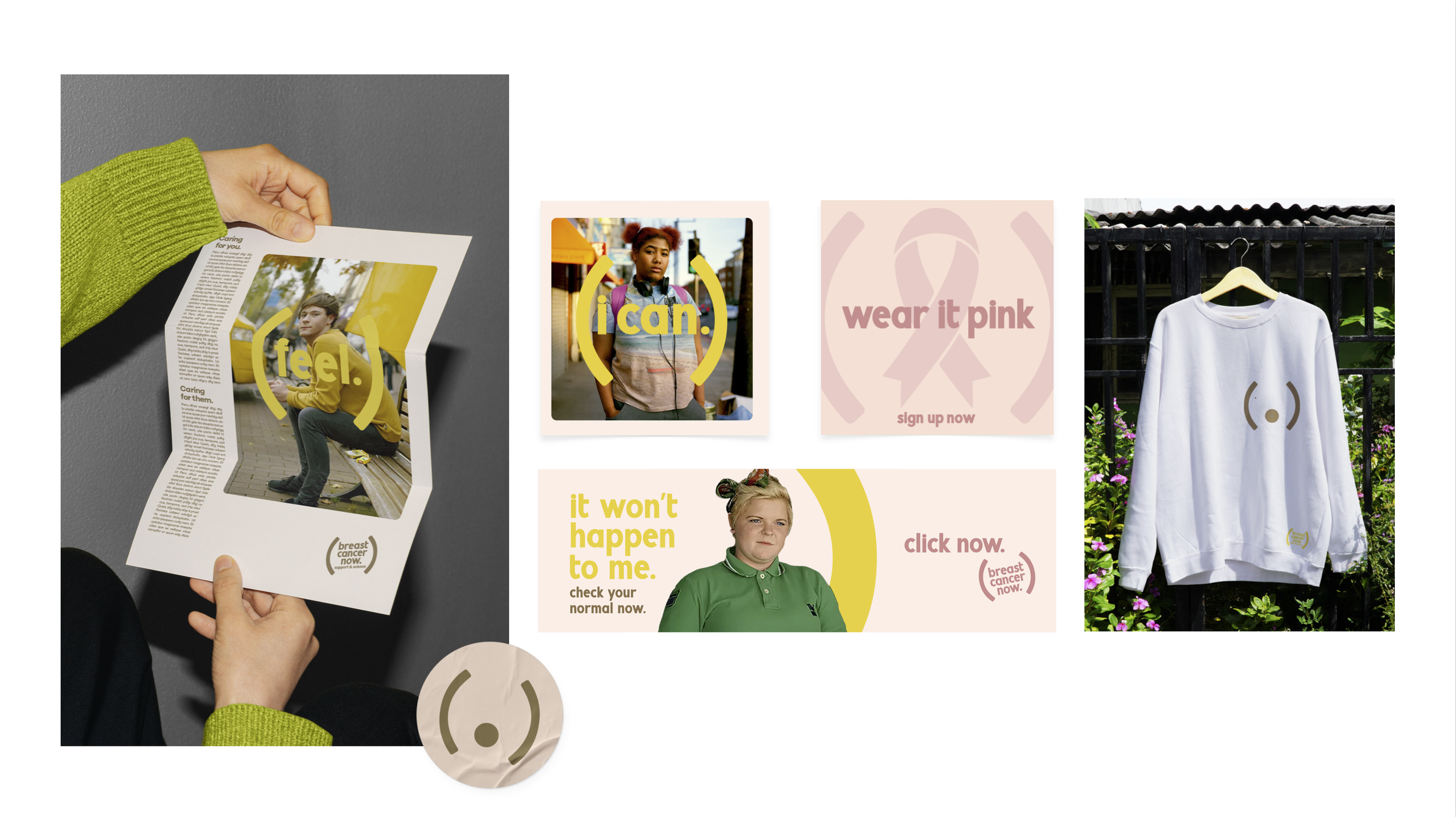
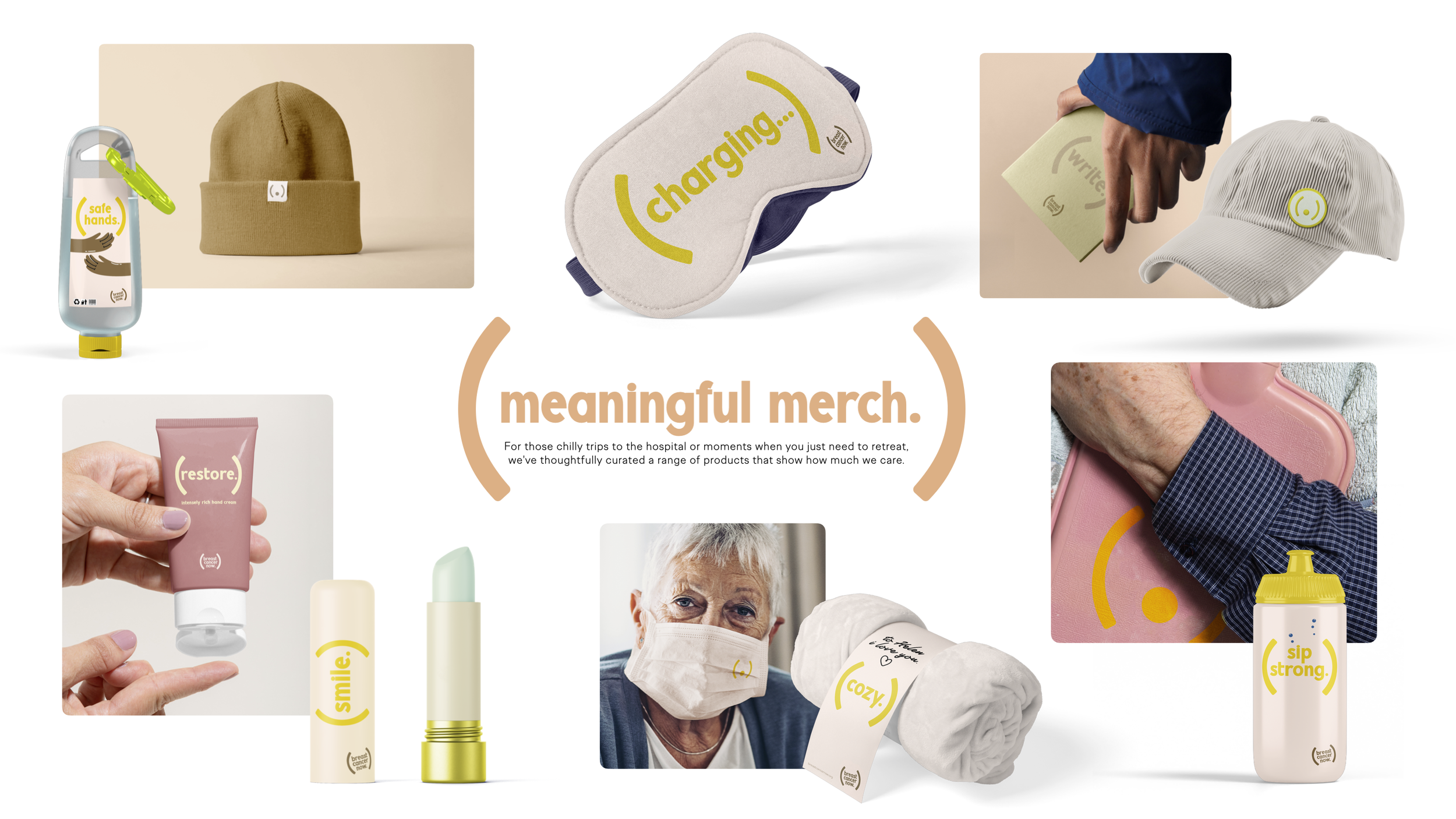
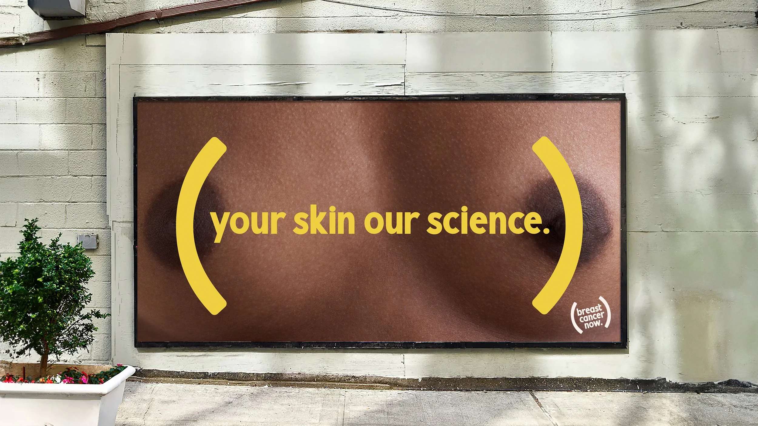
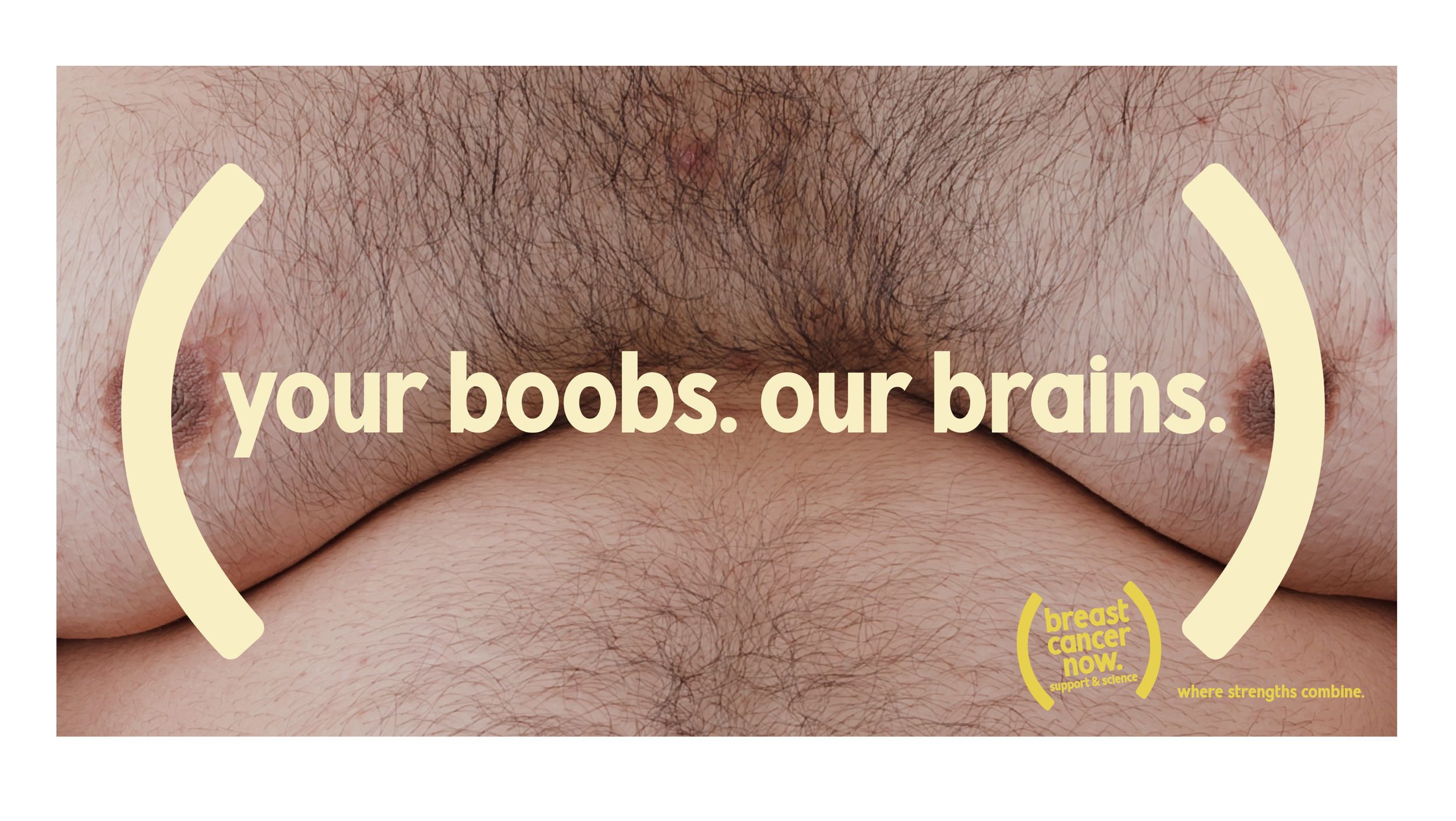
I built the identity around a simple bracket device. It echoed the shape of a breast while representing protection and care, framing key messages and subtly referencing scientific formulas. A small idea with a lot of thinking behind it.
Alongside the identity, I created a bold OOH campaign designed to flow into social. I also developed a launch idea where the logo never appeared in the same colour twice, adapting to different skin tones to reinforce that breast cancer can affect everyone.