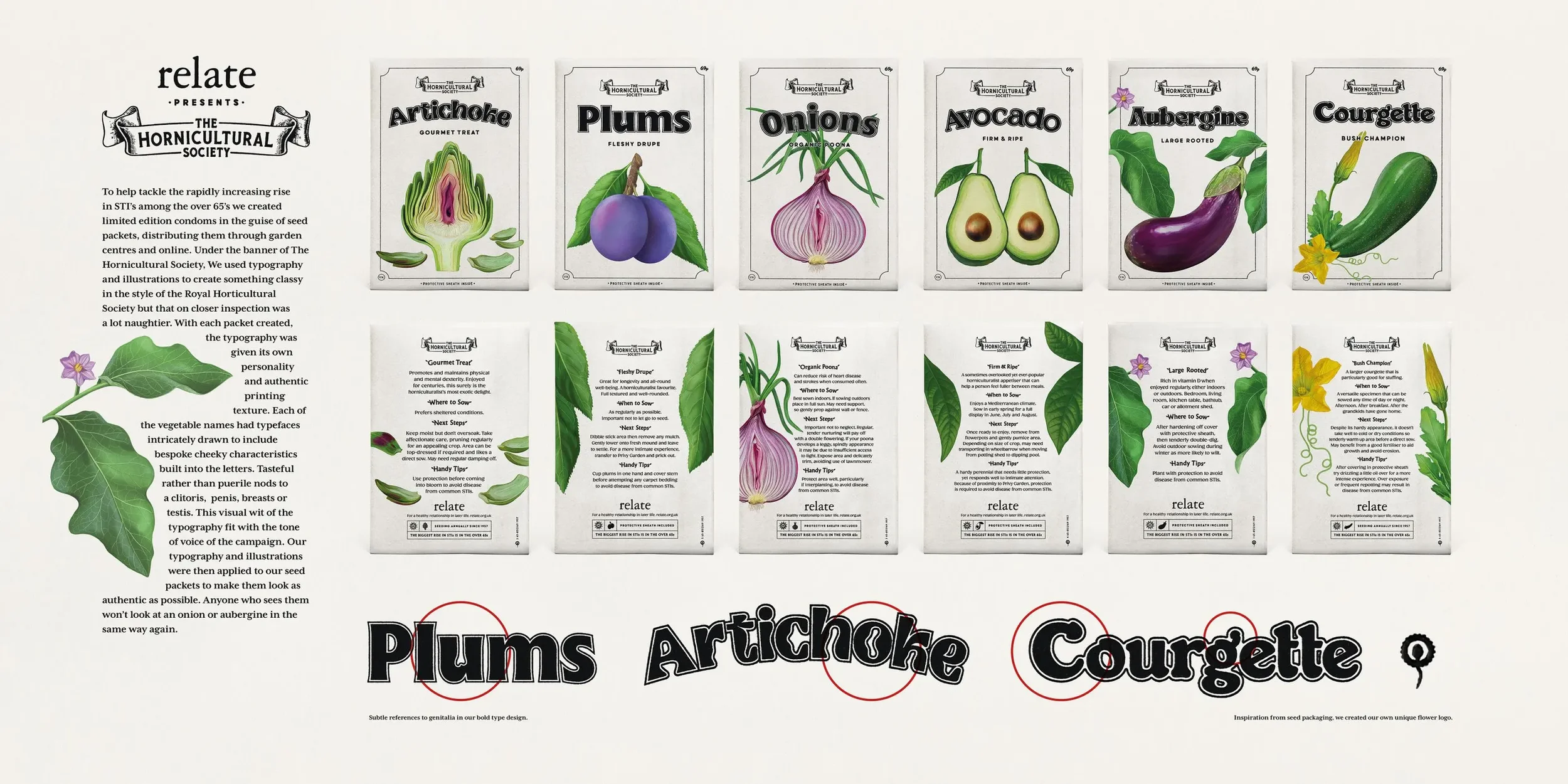
I was hands-on from day one, shaping everything from the cheeky double-entendre copy to the visual identity, art direction, typography and final execution.
To tackle the rise of STIs among over-65s, we disguised condoms as seed packets, placing them in garden centres and online to reach the audience where they already felt at home.
I hand crafted bespoke typographic system so each pack was individually crafted but worked as a set, layering authentic print textures, subtle imperfections and hidden design details to make every piece feel genuinely collectable. I worked closely with photographers and production to perfect every finish, ensuring the illusion held up in every detail.
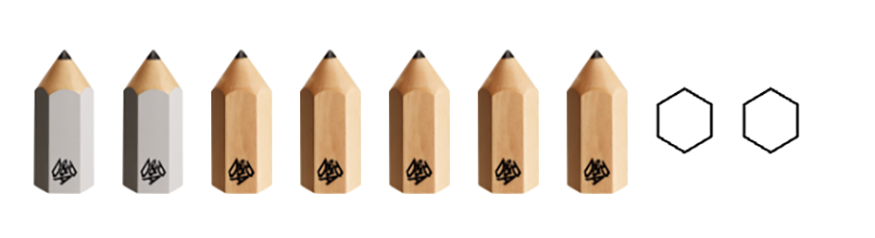
The campaign sparked national conversation, earned widespread press coverage, and went on to win D&AD, including No.1 Typographer and No.2 Design Director, demonstrating how exceptional craft can transform a strong idea into outstanding creative work.